
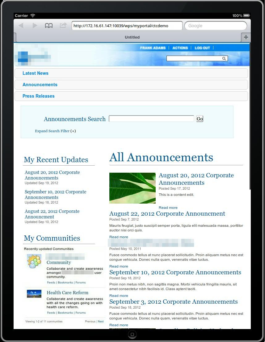
As a Technical Sales Specialist focusing on IBM’s Digital Experience portfolio, I often do WebSphere Portal and WCM demos. With all the interest in mobility, mobile capabilities are one of the key features I love to demo! Until recently, I would typically demo the Mobile Experience or mobile theme capabilities while showing a portlet or two, perhaps containing WCM content tailored for mobile device viewing. The introduction of responsive theme support in the latest version(s) of WebSphere Portal has made the mobile capabilities that much easier to demo while it also tends to get the audience engaged in the demo (at least in my experiences). That’s not to say I no longer demo the Mobile Experience, but I now like the ability to demo both the Mobile Experience as well as the responsive design to show the breadth of capabilities (and the latest announcement of Worklight integration capabilties will only make this story that much better). When it was initially released for Portal v7, I used a demo based on the fictitious “Lotus Company” Portal, but the responsive theme could not be applied to just any Portal instance. Since the release of Portal v8, there is a beta release release of the (CTC) responsive theme that is said to be a part of the next release of the Content Template Catalog (v4). The flexibility of this (beta) release of the responsive design theme has been great in that it can be applied to the latest release of the CTC and then customized as I typically do for Portal and WCM demos. The customization that I usually do for a demo involves creating a new “style” (a single CSS file I use to override the standard Portal style classes) for the theme, add that style to the styles.json file in theme, and then apply that “style”. I’ve also had to make changes to one of the standard responsive theme CSS files (theme.css) in order for the media queries (the basis of how responsive design works) to be triggered on an orientation change of the iPad, which I typically use to demo mobile capabilities. I’ve also played around with some of CSS classes in the theme.css so that some of the page and column layouts display a little a bit better. Feel free to reach out with questions around the details of any of the changes I’ve had to make. In the meantime, here’s a quick look at a Portal instance with the beta responsive design theme and a couple of different styles I created for recent demos…
| Landscape Orientation | Portrait Orientation (Notice the change to the navigation and page layout) |
|---|---|
 |
 |
 |
 |
 Kristopher S. Barry